PSDTUTS Updates |  |
| How to Create an Ice-cold Poster with 3D Text Screencast Posted: 09 Dec 2008 10:07 AM PST “In this tutorial, you’ll learn how to combine stock images and 3D text into a cool poster. We’ll use an icy theme for it and color it the way we want. You’ll see it’s not that hard to create a simple appealing poster with effective use of text and imagery” - Ben Merckx
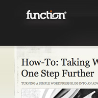
Here is a link to the written version of the tutorial How to Create an Ice-cold Poster with 3D Text and the video version is below. |
| How to Create an Ice-cold Poster with 3D Text Posted: 09 Dec 2008 09:53 AM PST In this tutorial, you’ll learn how to combine stock images and 3D text into a cool poster. We’ll use an icy theme for it and color it the way we want. You’ll see it’s not that hard to create a simple appealing poster with effective use of text and imagery.
Final Image PreviewBefore we get started, let’s take a look at the image we’ll be creating. Want access to full PSD files and downloadable copies of every tutorial, including this one? Join PSDTUTS PLUS for just $9/month. You can view the final image preview below.  Video TutorialOur video editor Gavin Steele has created this video tutorial to compliment this text + image tutorial. Step 1For this tutorial I’ll recreate the poster on a smaller canvas. Create a new photoshop document of 600px by 848px. To start off with the background get an interesting texture from cgtextures, I got mine here (Image 3). Import it and resize it. In my case, after resizing, it did not cover all of the canvas. To make the texture cover a larger area, duplicate the layer (Right-click the layer and select Duplicate Layer…) and place it on top. To make those two layers blend into each other, use a soft brush and erase the bottom of the top layer.  Step 2To darken the texture, we first desaturate it. This can be done with a Hue/Saturation adjustment layer (Layer > New Adjustment Layer > Hue/Saturation…). Set Saturation at -100 so the texture turns gray. Create a Brightness/Contrast adjustment layer (Layer > New Adjustment Layer > Brightness/Contrast…). Set Brightness at -111 and Contrast at +36. 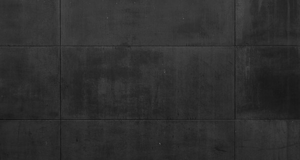 Step 3Create a new text layer with the text “ICE ICE ICE” in a white color (font: Century Gothic bold). Give it a huge font size (165pt) and place it so the letters are cut off by the edges. Set the Opacity of the layer to 13%. Go into the Blending Options (Right-click the layer and select Blending Options…) and give it an Outer Glow. Choose a blue color and play with Size and Spread to change the size of the glow (my settings are a Spread of 22% and a Size of 19px). 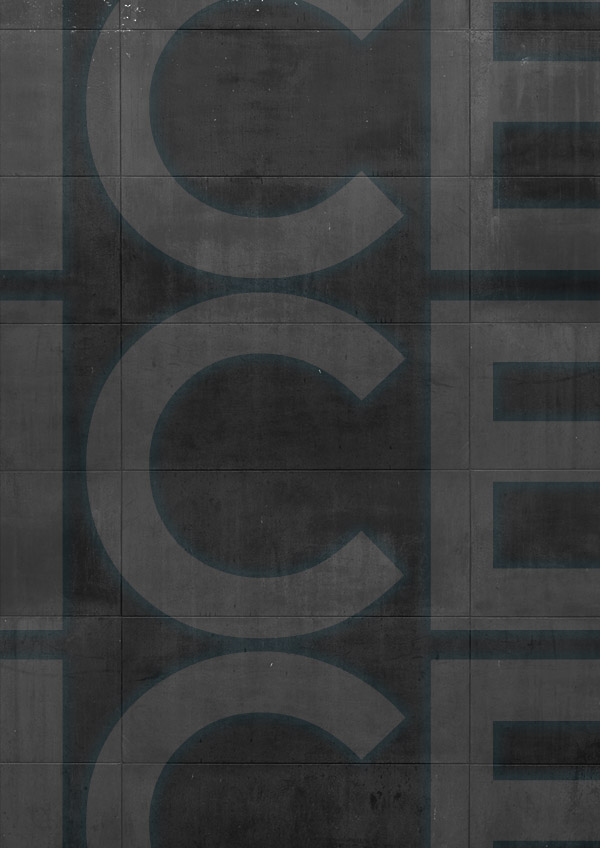 Step 4Create a new layer and use a soft brush at 180px to create a light blue (#34d1f8) area like in the preview. Give this layer an Opacity of 38%.  Step 5You can get the next two stock photos here and here. Import them on seperate layers. Transform the "clouds" stock until you find a nice angle. Desaturate it (Image > Adjustments > Desaturate) and set the layer to Hard Light at 50%. Use a mask to cut off the parts you do not want to show (Layer > Add Layer Mask > Hide All, use a soft white brush on the mask to reveal the clouds again). Place the "skyline" stock beneath the "clouds" and give it a Gaussian Blur of 4.3px (Filter > Blur > Gaussian Blur…). Use Hue/Saturation to give it a blue color (Image > Adjustments > Hue/Saturation…). Use a mask on the "clouds" layer to hide all the parts you do not want to show. Set this layer to Screen at 50%. 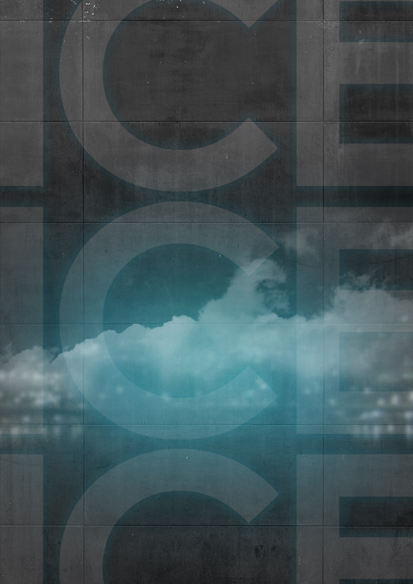 Step 6Place the "ice cubes" which you can find here, on the canvas. They need to be recolored so use Hue/Saturation to give them a blue color (Image > Adjustments > Hue/Saturation…, with Hue of 191, and Saturation of 32). Set this layer to Screen. 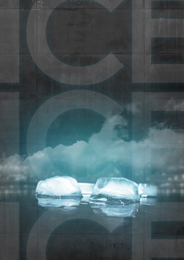 Step 7To create the big “ICE ICE” text you can use photoshop or a 3D program like Xara 3D which can be used to create 3D text easily. Whichever you are using, create the text in Century Gothic bold and lay over a texture like this one. In Xara 3D you can do this in Options > Texture… Export it as a transparent PNG (you can change this in the export dialog box). If you are using Photoshop to create flat text, just import the texture on a new layer above the text. Hit Command + Alt + G so the texture will overlap the underlying layer.  Step 8Create a new layer above the text we just made. Hit Command + Alt + G so you can only work over the text. Take a soft white brush and brush over the letters. Set this layer’s Opacity to 85%. 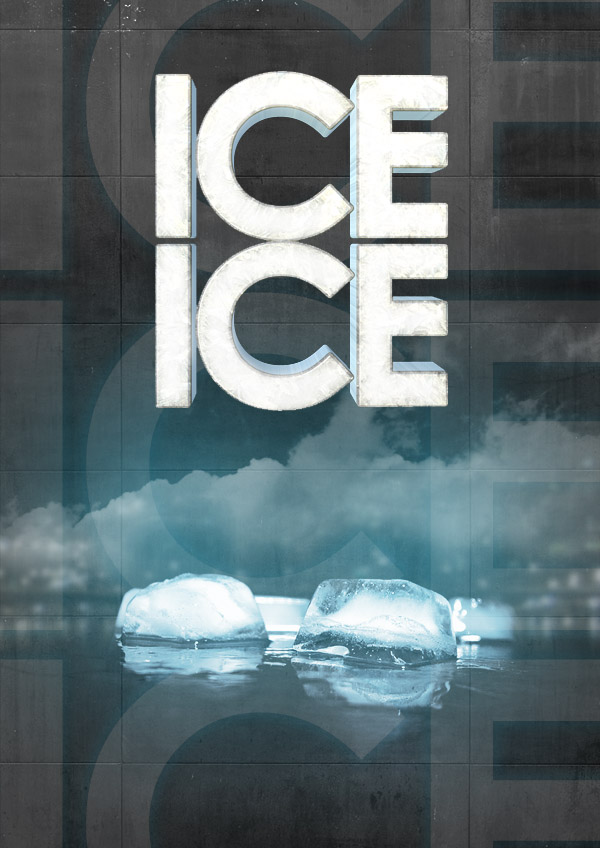 Step 9Create a new text layer with the text "baby." The font I used is Birdman, which you can get for free on dafont. Go into the Blending Options (Right-click the layer and selected Blending Options…) and give it a blue Outer Glow. Between the ice text and the "ice cubes" create yet another text layer for the DJ’s name. In the Blending Options you can give it a Gradient Overlay. Choose Radial as Style and use a black to white gradient. Change the Opacity to 30%. 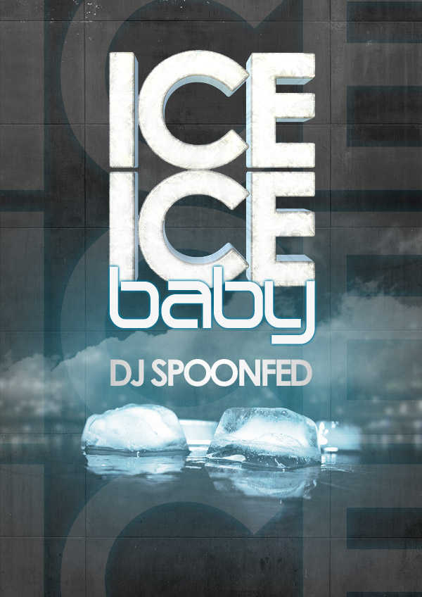 Step 10Create a new layer on top. We’ll create a box to display some details about the event. Make a rectangular selection in the left bottom corner. Use Apply Image (Image > Apply Image), this will fill the selection with whatever is displayed in it at the moment. Now blur the selection (Filter > Blur > Gaussian Blur…, at 4.3px). 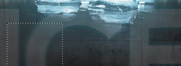 Step 11Create a new layer while keeping the selection active. Fill the selection with white and change the Opacity to 5%. In the Blending Options, give the layer a Drop Shadow and change the Opacity of it to 100%. Again create a new layer while keeping the selection active. Now use a very large soft brush with a blue color (#64b1d1) and click once on the top left corner. This should give you a blue gradient over the selection. Lower the Opacity of this layer to 40%. 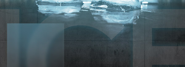 Step 12Now create the text layer for the details. I like to vary font sizes and line-heights to create appealing text. Again I used Century Gothic and centered the text.  Step 13As a finishing touch we can lighten the up ice text even more. Create a new layer on top and take out a soft white brush. Click once on places where you’d like extra light. Set the layer’s Opacity to 70%. 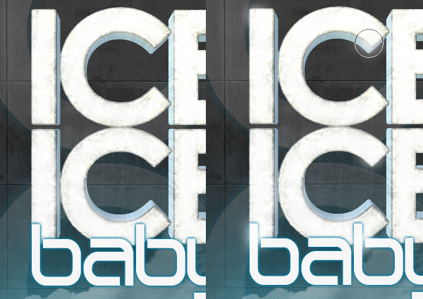 Step 14Create a Gradient Map (Layer > New Adjustment Layer > Gradient Map…) from dark blue (#061731) to a lighter orange (#f5d9a8). Set this adjustment layer to Darken at 65%. On this layer’s mask use a black soft brush to brush over the ice ice baby text so it doesn’t turn orange. As a final touch, create a new layer and use Apply Image (Image > Apply Image). Go to lighting effects (Filter > Render > Lighting Effects…) and change apply as shown. 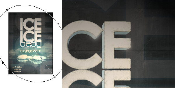 ConclusionSet this last layer to Soft Light and lower the opacity a bit. You’re all done! Subscribe to the PSDTUTS RSS Feed for the best Photoshop tuts and articles on the web. |
| $25,000 Giveaway, $10 each for the first 2,500 people … Posted: 08 Dec 2008 02:51 PM PST What’s the best way to try out a new service? To try it for free! That’s why today I’m very excited to be offering a massive $25,000 giveaway here on PSDTUTS for readers to head over and spend on ThemeForest. All you have to do is give us your username (you must have a registered account for us to credit) and a link to your favourite file, and the first 2,500 commenters will receive $10 each on their account - that’s all there is to it! The great thing about this promotion is not only do readers get to try out the site for free, but all our awesomely talented authors will make more money!
Instructions for the FREE Money!!All you have to do is:
Once the quota has been filled, a couple days later you’ll get an email letting you know that your account has been credited and you can go a-spending! Important: You can only enter one time and we will be running some checks on your IP address and sign up parameters to keep things fair. We’ll remove any duplicate people - sorry guys, one credit per person! All decisions are final. If you don’t receive the email / credit for some reason it means something went wrong - you mistyped a username, email address or didn’t link to a favourite file. We’ll do our best to make sure we fix any accidents, but as you can imagine with 2,500 entrants it’s hard work going through them all by hand Wrapping up Web Design WeekSo with this post, Web Design Week is coming to a close! It’s been some week, 6 articles, 4 tutorials and about 20,000 thousand words. It took me way longer to write than I’d planned. When I started I told Cyan "I’ll just write one article", then it became "just three", then a week, then a week with double posts some days! Oh well, if nothing else I got my post count up again, gotta keep up with that Sean Hodge character! The unofficial theme for the week turned out to be separation. In our tutorials we separated layouts from style and background choices to show, and in our articles we looked at how web design itself can be separated up into different parts. In case you missed any of the posts, you can find links to them below. WDW Tutorials
WDW Articles
VideoHive is Online You may also be interested to know that today we have just launched our fourth Envato marketplace - VideoHive! The hive is really just getting started so it’s a bit more of a soft launch than some of our others. We’ve ported over 700 or so motion graphics videos from FlashDen and added two new categories - Stock Footage and Project Files which will start filling up over the coming months. … And if you’re into Video and After Effects, then you’ll be very excited to know that Skellie is almost ready to roll out AETUTS in a matter of days. So it’s going to be a big finish to 2008 for us here at Envato!
|
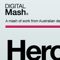
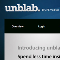
| Five Looks, One Layout: How to Develop a Library of Web Design Styles at Your Fingertips Posted: 08 Dec 2008 12:52 PM PST Earlier in Web Design Week we saw how a simple layout can be mixed and matched with different backgrounds, patterns and photos, today we’re going to take that one step further. We’re going to completely change the look of a website by changing not just the background, but the overall style of the design. We’ll begin with the Grungy Paper Texture Site we created in a past tutorial, then we’ll change the design to look minimal, metallic, abstract, and web2! And after that we’ll talk about the process of learning a library of web design styles. So let’s get started…
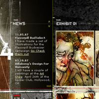
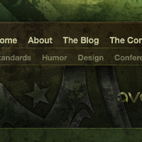
Style 1 - Grungy / Textured (Original)So as you recall from our original tutorial the site design looks like this:  It’s a grungy looking, textured design based on a simple, solid, underlying layout. What we’re going to do is take that underlying layout and treat it like a coathanger, swapping different styles in and looking at why each look works. Some Characteristics of a Grungy / Paper LookIn every style there is plenty of variation, but here are a few hallmarks of a grungy sort of look:
Some great examples of Grunge design:
Good Articles on Grunge Design
Style 2 - A More Minimal LookOur first design step is to pare back our look completely and get rid of anything that isn’t essential. We want to do this so that we have a starting point for the other designs, but along the way we’ll be creating a sort of minimal look. These are the steps to take:
Here is our minimal version: 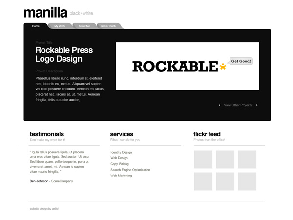 Of all the looks we’re going to do today, this is the least suited to this layout - in particular to the tabbed area. Still it’s an OK approximation… 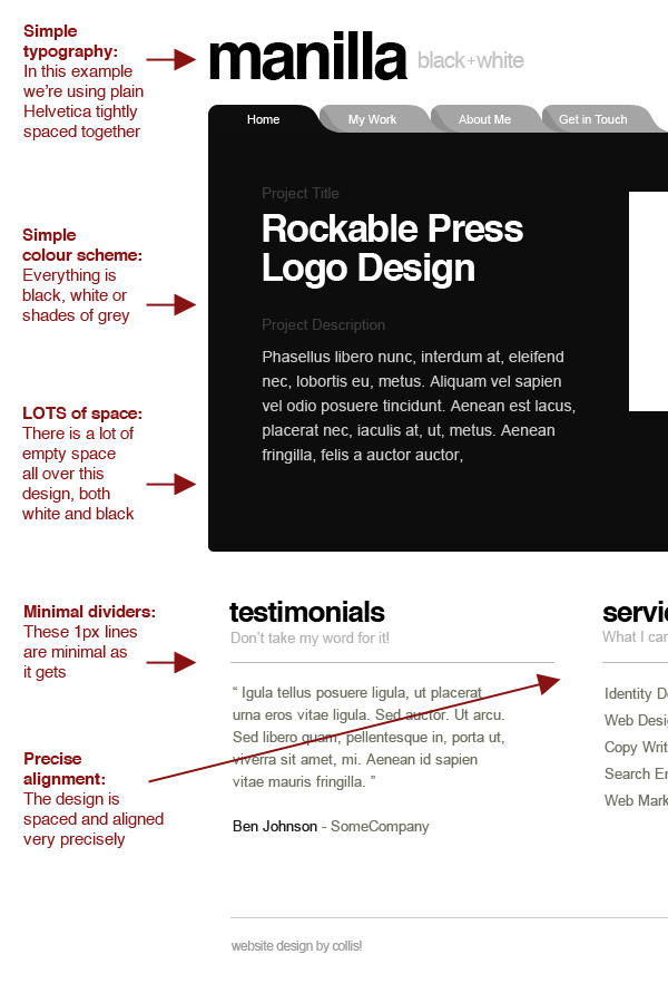 Some Characteristics of a Clean, Minimal LookIn every style there is plenty of variation, but here are a few hallmarks of a minimal sort of look:
Some Great Examples of Minimal Design:
Good Articles on Minimal DesignStyle 3 - Metallic LookTaking the minimal look we just created, we can now add some style back in. This time we want to make a metallic sort of look. For that we need some light greys, and these look especially awesome on a dark background. These are the steps to take:
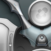
Here is our metallic version: 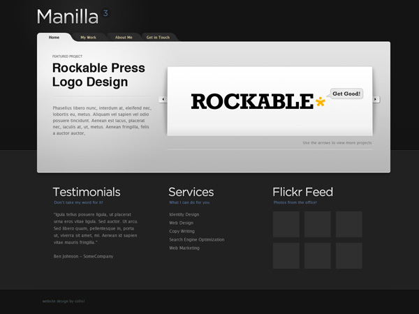 And here’s some notes: 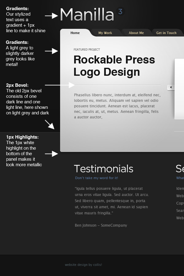 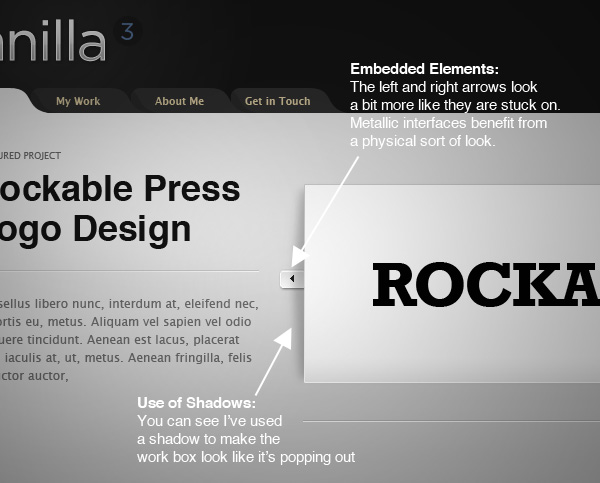 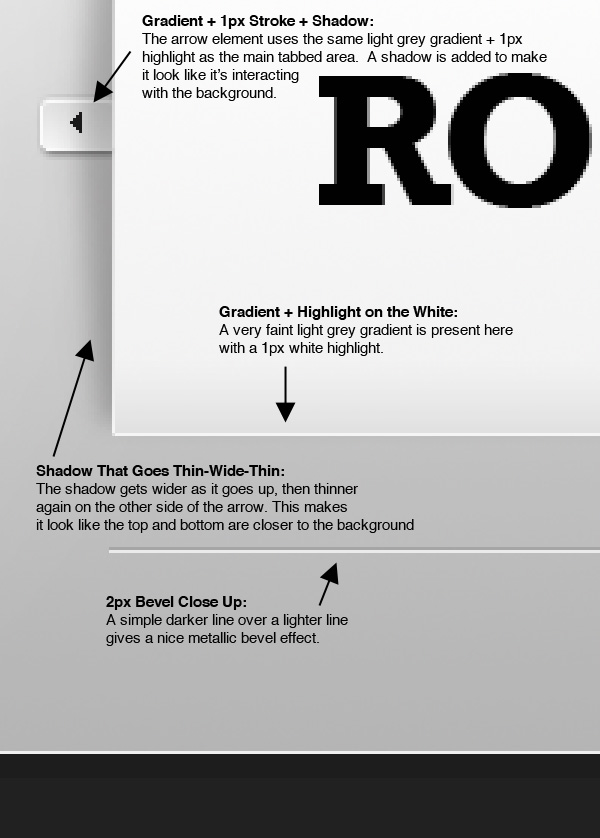 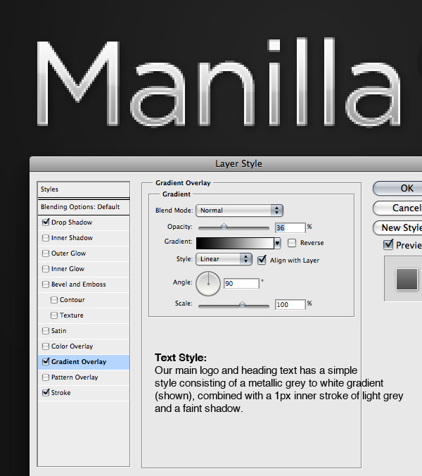 Some Characteristics of a Metallic LookIn every style there is plenty of variation, but here are a few hallmarks of a metallic sort of look:
Some Great Examples of Minimal Design:
Good Articles on Metallic EffectsStyle 4 - Abstract + TransparencyA look that’s always popular is to use an abstract background, some transparency and some super clean typography. So that’s we’re going to do next! So, starting again from the minimal design:
Here is our abstract version: 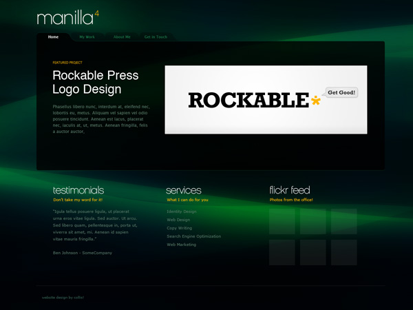 And here are some notes on the design: 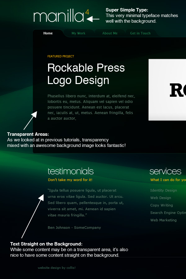 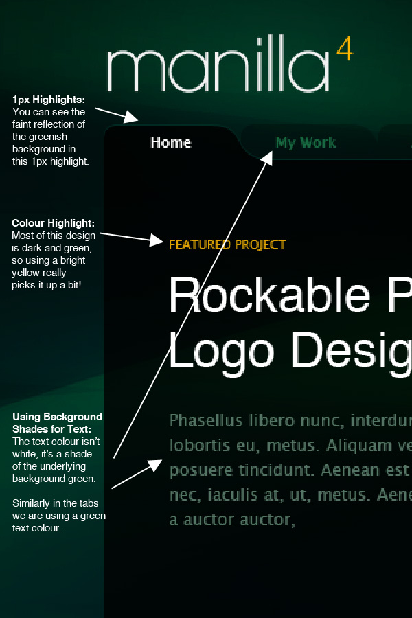 Some Characteristics of an Abstract/Transparent LookIn every style there is plenty of variation, but here are a few hallmarks of a this look:
Some Great Examples of an Abstract / Transparent Design:
Good Articles on Abstract/Transparency LooksStyle 5 - Web 2.0!Our last style stop is in the cliche’d land of Web 2.0 design. I must admit I’m not even really sure what web2 design really is, but I’ve tried to make this version kind of friendly and approachable - which I guess is the main characteristic of the style. Starting again with the minimal design:
Here is our web 2.0 version:  And here are some notes! 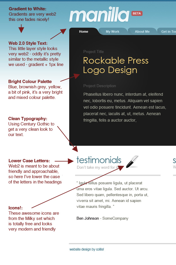 Some Characteristics of a Web 2.0 LookIn every style there is plenty of variation, but here are a few hallmarks of a web 2.0 sort of look:
Some Great Examples of Web 2.0 Design:
Good Articles on Web 2.0 Design
Five Looks, One Layout - What This is Meant to ShowSo here they all are, you can click the image below to see them at full size. Also if you are a Plus Member, you can grab all five PSD files from the Plus area. 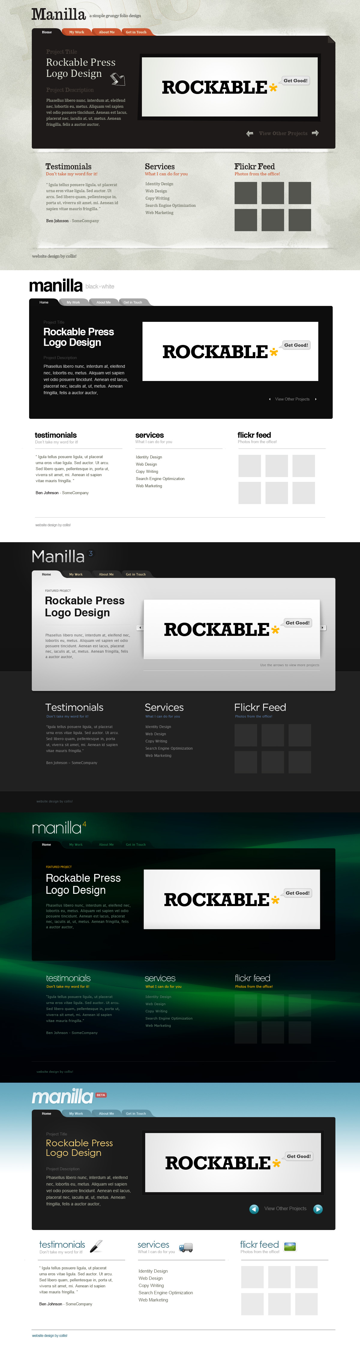 So let’s be honest, the five layouts aren’t necessarily particularly good examples of their respective styles. My aim rather in this tutorial is to show you how you can give a design a certain look or style by following certain visual cues. You should be able to see that you can dress the same layout in different ways. To really produce a great example of a certain design style, you would probably change your layout more specifically to suit that style. And of course they’d all need a lot more time than I had Learning a Library of Web Design StylesIn our previous article - 8 Ideas, Techniques and Tricks for your Web Design Toolkit, I mentioned that it’s a good idea to have a library of styles to draw on. When you’re drawing a blank when starting a new project, it can sometimes be good just to fall back on a predefined stylistic choice and then let that guide you. Inevitably you’ll wind up with something totally different to anything you’ve designed before, and it’ll at least help get you started. But be very wary of using the wrong style just because it looks cool, and not because it is appropriate for the client / message / content. The only antidote to doing this is to know and have a lot of different design styles. In this article we’ve briefly looked at five looks or styles, and there are millions of styles, substyles, combinations, adaptations and looks that just defy style all together. Visual LearningThe only real way to learn design styles is by looking at them. Now there is looking and then there is looking! A regular person will usually look at a website, poster or some other design and just see the content, the message and maybe the feel of the design. As a designer you need to look at everything in an analytical way, look to see why a design has a certain feel, what message the design itself is giving, what fonts have been used, what visual elements and techniques the designer has used, how it’s been combined and how it’s been arranged. You should always be looking at design - not just online, but everywhere - because design styles are in no way limited to websites. Posters, advertisements, television credits, flyers and anywhere there is design, there is an opportunity to learn. Styles at Your Fingertips, but Expressed in Your Own VoiceThe more look and learn, the more you will have at your command. When you sit down to design a new project, you’ll be able to pull up new visual ideas even when faced with a blank canvas. When you’re given design materials or brands, things like typefaces, logos and messages will trigger stylistic choices like clues to a mystery. When you do make use of styles you’ve seen before, you should always strive to let your own design voice be heard. Give it your own spin, you’re own particular mix or look, so that your design voice is heard. And always, always, make sure you are applying design that suits and enhances the message - don’t fall into the trap of only thinking of the aesthetic. Remember form follows function. The style and aesthetic choices you make are there to help the website fulfil its function.
|


 Part of Web Design Week
| You are subscribed to email updates from PSDTUTS To stop receiving these emails, you may unsubscribe now. | Email delivery powered by Google |
Inbox too full?  Subscribe to the feed version of PSDTUTS in a feed reader. Subscribe to the feed version of PSDTUTS in a feed reader. | |
| If you prefer to unsubscribe via postal mail, write to: PSDTUTS, c/o Google, 20 W Kinzie, Chicago IL USA 60610 | |
No comments:
Post a Comment