PSDTUTS Updates |  |
| The 3 Components of Good Web Design Posted: 02 Dec 2008 07:00 AM PST Good design isn’t just about good looks, and nowhere is this truer than in web design. In fact it makes sense to think of web design as being made up of three major non-technical components: aesthetic design, information design and interface design. If you want to be a great web designer it’s essential that you have a firm grasp of all three.
Aesthetic DesignAesthetic design is all about getting the look right. If you are good at this it means you will be able to design sites that not only look good but are appropriately designed. Different designs convey different messages to an end user, so it’s essential that a design matches the site’s message. The other day I was walking through a supermarket and saw a juice brand that had the visual design of a laundry detergent. There was just something about the way the box was done that I momentarily wondered why there was detergent in the fruit juice aisle. In the same way giving a website an inappropriate package for its content and message - even if it’s a really good looking package, is a bad end result. This is why it’s very important as a web designer that you don’t simply follow fads and trends blindly. You must always be thinking not just how you can make a site design look good, but also look appropriate. Out of the three components of web design, aesthetic design is surely the one that people most identify as being design. One thing I find interesting about aesthetic design is that it is deceptively difficult. I remember once designing a poster and showing it to a friend who commented "oh it’s just a few lines and some text, you must have done this in about ten minutes" - ah the joys of being a designer! Information DesignInformation design is about preparing the information on a website in the best possible way, so that users can efficiently and effectively find and digest information. In larger sites, just finding information becomes challenging, but in sites both large and small, processing it is always a design problem. A quick example of information design is in how you organise and format text on a page. Because people tend to skim through content on a screen, it’s much better to organise it with headings and subheadings, diagrams and visual hooks, and general variation for the eye. Techniques like these make the information on a page much easier to digest. But information design isn’t limited to what’s on a single page, itis also about what structures you use to house the site’s parts, how you lay out the menus and submenus and how you cross link different sections. You may be interested to know that in larger and more complex projects and sites, there is in fact an entire profession dedicated to modelling and structuring information called Information Architecture. The most famous Information Architect that I know of is Jesse James Garrett who incidentally coined the term AJAX. He’s pretty neat and you can read about him at Wikipedia. Collis’ Awesome DiagramSince we’re talking about information design, it seems like a good opportunity to turn 6 paragraphs of waffley text into a diagram, so I present to you my awesome diagram of the components of web design! Bask in its red and grey awesomeness! 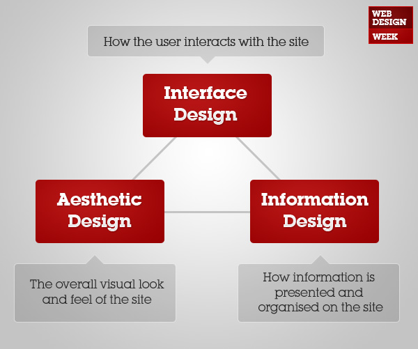 Interface DesignInterface design is the arrangement and makeup of how a user can interact with a site. The word interface means a point or surface where two things touch. So a web user interface is where a person and a website touch - so menus, components, forms, and all the other ways you can interact with a website. Good interface design is about making the experience of using a website easy, effective and intuitive. It’s actually much easier to demonstrate bad interface design because that’s when you really notice it. A simple example of interface design is the use of icons. Have you ever looked at an icon and thought "what is that meant to represent?!" - well that would be bad interface design. Using icons to label and signify different types of content or actions is just one part of interface design. Incidentally another example of interfaces that you will likely encounter as a web designer is Application Programming Interfaces or APIs. An API is the set of functions and protocols by which you (or your program more precisely) can interact with whatever the API is for. So for example Google Maps provides an API which you can use to create applications or sites that work with Google Maps. What about …Now you may be thinking, that’s all very well and good Collis but where does CSS fit into this? Or what about Flash? Well as I say, these are the three non-technical aspects of web design. On the flip side there are all those technologies and skills like HTML/CSS, Flash, Javascript and so on. But I tend to think they are more a part of web development than web design. In the same way that it’s important to separate HTML and CSS to keep information and presentation separate, you could argue that how you make a design come into reality is separate from the design itself. In simpler terms, is knowing a specific CSS hack anything to do with design? Don’t get me wrong, you need to know how to build things in order to design them appropriately. However when it comes to saying what makes up web design, my answer remains Interface Design, Information Design and Aesthetic Design. What’s your take? Have I missed some essential part of web design? Or do you think that web development is an essential part of web design itself? Later this week you’ll be able to read more in-depth articles of tips and tricks for each of these three components of web design - interface design, aesthetic design and information design. In fact the first one is going to go up in a few short hours.
|
| How a Simple Layout Can Be Mixed ‘n’ Matched with Patterns, Photos and Backgrounds Posted: 01 Dec 2008 10:10 AM PST It’s pretty amazing how much colour and background can change the look and feel of a website. In this tutorial we’re going to put together a quick, simple but effective layout and then create variations using backgrounds, photos and patterns. We’ll also look at how to make seamless tiled backgrounds out of a photo, methods for ending a single photo and simple ways to create pixel patterns. In short it’s a jam packed tutorial!
Step 1 - Creating the Basic Layout So our first task is to design a layout for our page. We’re not going to do anything too fancy because the tutorial is about backgrounds more than layouts. Still it should look good and be an actual workable layout. So in the image above you can see my plan of rough components of the page. I’ve planned in a menu and submenu, a panel to introduce the section and a content area. I’ve also planned that it should be less than 1000px so that when a person on a small screen views the site they still see the background properly (since that is going to be a big feature of the design). Now I should point out in reality I didn’t actually draw out this set of boxes quite like this. It was more like just muddling around until I thought "oooh that’s a nice layout". But for the purposes of this tutorial it makes better sense to explain it this way! 2 - Fleshing it out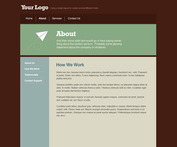 So that layout is our bones, now we need to flesh it out with some dummy content and a colour scheme. 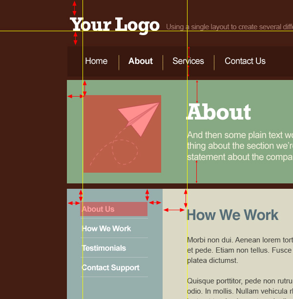 As you can see I haven’t done anything really amazing here, just placed the elements on the page fairly neatly and evenly. So note that spacing. In the image I’ve tried to show how different elements line up (yellow lines), how spacing is roughly even vertically and horizontally as well as above and below elements. Note that these are just rough guides and I actually just work by eye until things look right. But if you are unsure of spacing, doing things fairly evenly is not a bad place to start. As you get more comfortable with spacing you can vary things up and play with uneven balances. 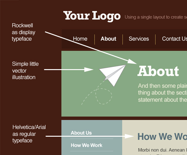 In the image above you can see I have chosen a main display typeface called Rockwell that we’ll use in the heading panel to give the page a bit of character. If I were building this site that might be an image or inserted using sIFR. The rest of the text is Helvetica and Arial which of course is suited to HTML use. Also I threw in a vector illustration of a paper plane that I drew years ago and sell as stock. Of course in a real project, this image would be something to do with the site instead of just randomly thrown in as I have here.  Finally I’ve used a warm, earthy tones colour palette. I’m actually a bit of a fan of beige and earth colours and you’ll find I use them a lot. I think they go a long way to making websites look friendlier and more approachable. So the page is looking OK, but there’s nothing very memorable about it yet and it’s a bit basic. In the next step we’ll add some polish. 3 - Polishing and Adding Some Style OK so here you can see the exact same layout but I’ve polished it up and added two visual elements to give it some style. The first element is the arrow cut out of the side menu. This makes the middle panel look like a kind of overgrown speech bubble. The second visual that you’ll see when you look close up is a sort of dot theme. So in all we’ve used three visual elements to give the page some style: an illustration, an interesting grid-breaking shape, and a subtle theme based on a simple shape. Later we’ll add a fourth visual element - a background - to finish off the site’s style. 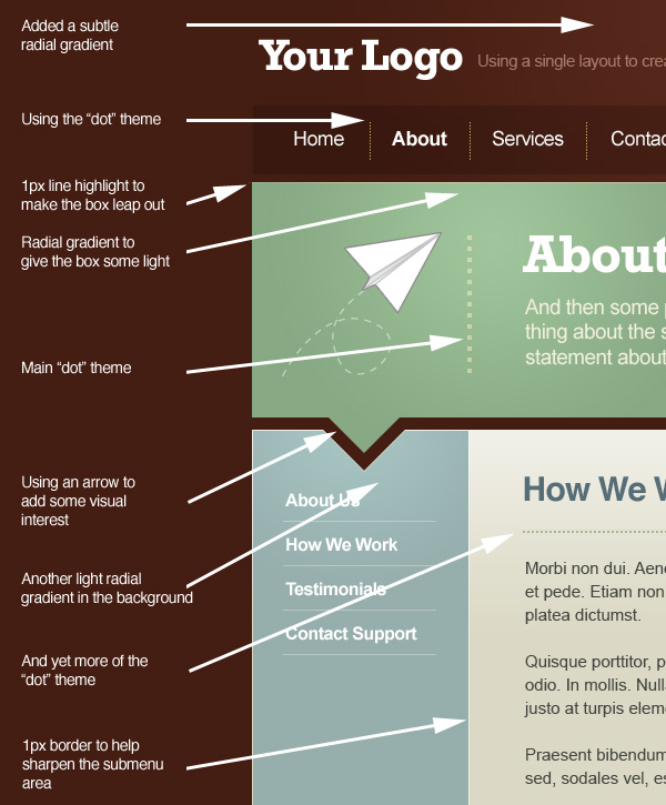 In the image above I’ve pointed out all the bits of polishing that I added. It’s all just little highlights and graduations in colour, dots, and of course the cut out arrow. You might also be interested in a previous article I wrote a year ago about polishing web designs here on PSDTUTS. View Before and AfterSo with that we have our basic layout! 4 - Adding a Tiled Background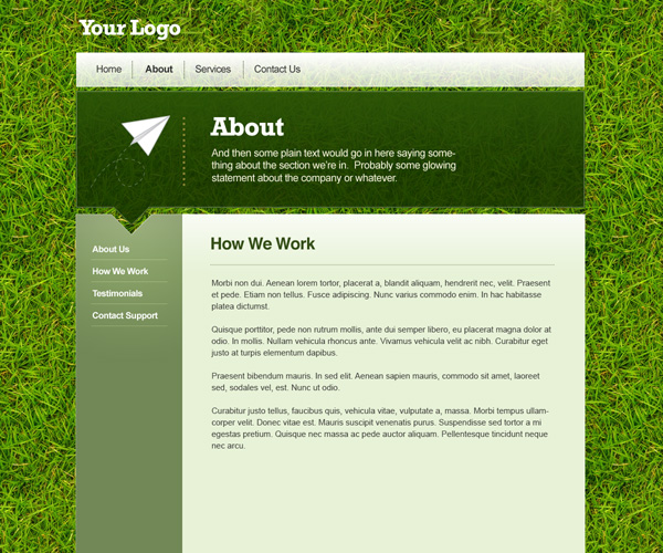 So the first background we’re going to swap in is a tiled image. In this instance we’re using a grass photo that I used on that grass text tutorial (a series which I have yet to finish Of course if you try tiling the original photo it’s not going to look very good and it will be obvious that you’re just repeating the same image over and over. Instead you need to alter the image so that it tiles seamlessly. Fortunately I just put up a tutorial on this very subject, so head over and read: How a Turn a Texture into a Seamlessly Tiled BackgroundAlong with the change in background of course I have updated the colouring to suit the new look. Notice that I’ve avoided using the same shade of bright, light green as the grass - doing so would have been overpowering. Instead picking shades of duller greens darker and lighter complements the background. 5 - Mixing Transparency with the Background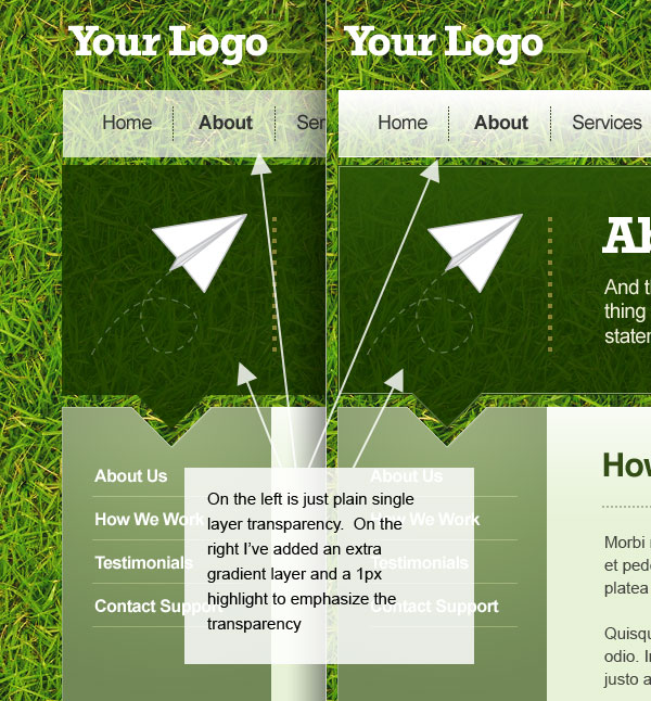 Now backgrounds like this are perfect for adding transparent layers over the top. Here both the About panel and the Menu have some transparency and it looks awesome because you can see some of the grass coming through and it adds some depth. Although you can just simply dim the opacity of the appropriate layer down, another option is to add a couple more layers on top - one with a slight gradient fading to nothing and the other with a 1px highlight. In the image above you can see for example on the menu that I have a block of white set to 70% opacity, on top of that there is a gradient from white to nothing, and on top of that is a 1px white line on the bottom edge. These additional layers emphasize the transparency and give the image depth. 6 - Creating a Quick HTML Transparent PNG test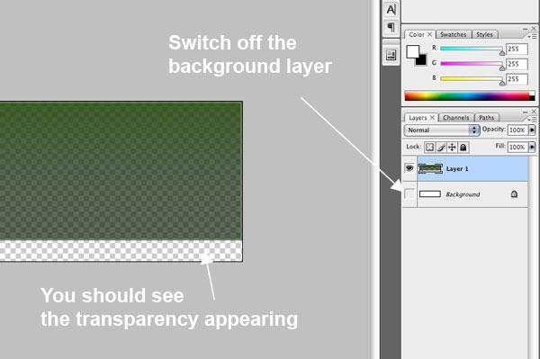 So all this transparency is easy to do in Photoshop, but you might be wondering how feasible it is to build such a design. Happily it is possible thanks to the .PNG file format which lets you use transparency in your images. One thing to be aware of though is that while you can do transparency (e.g. 60% opacity) you can’t do layer blending modes (e.g. Multiply or Overlay). Since in a Photoshop design it’s important to not do anything that isn’t actually buildable, all I’ve used is opacity settings. It’s more limiting but you can still get nice effects. So let’s create a quick HTML test just to make sure everything really works how we imagine it will. To create a transparent PNG, first we’ll merge the layers for our big panel shape into one. Because all the layers have some transparency the end-result after merging is also semi-transparent. Now just copy that into a new Photoshop document, then switch off the background layer (see the image above) and you should see the transparency showing through. 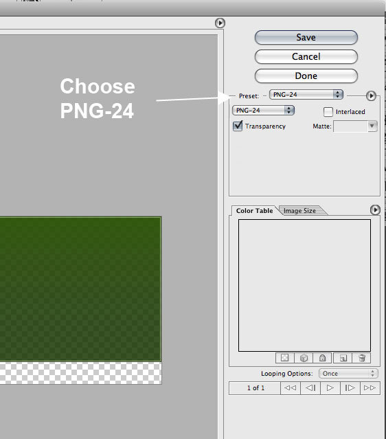 Now go to File > Save for Web & Devices and choose PNG-24 from the options. You should see the same transparency appear in the preview window. 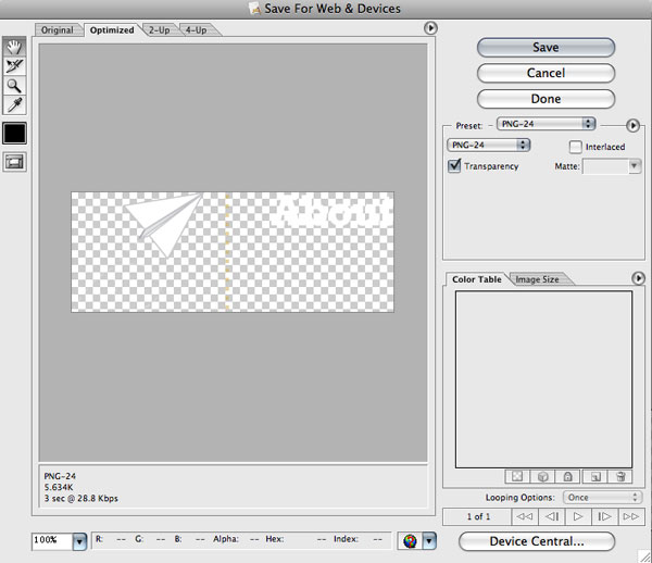 Next I’ll do the same thing for a few more image elements, because in our test we want to demonstrate that it’s possible to place a transparent PNG on top of a transparent PNG on top of a background. 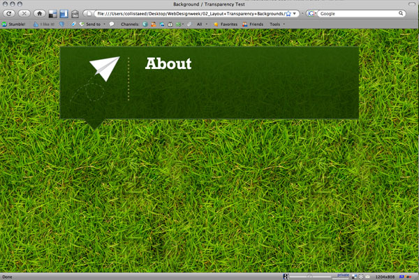 With all our images created, it’s now just a matter of putting some HTML together: <html> <head> <title>Background / Transparency Test</title> <style type="text/css"> <!-- body { background-color: #4B7E07; background-image: url(background.jpg); color: #FFFFFF; } div { width:802px; height:184px; padding:30px; background-image:url(green.png); color:#ffffff; margin:auto; margin-top:50px; } --> </style></head> <body> <div><img src="about.png" /></div>
So all we’re doing here is setting the background image to be our tiled JPG. Then placing a <div> centred on the page with its background image as the first transparent PNG. Then inside that <div> we have the second transparent PNG file. View the Transparency TestThat’ll do to prove that this design is buildable. Actually you’d need to do some fixing to make it work in IE6, a Google search reveals lots of articles on the topic, but since this is PSDTUTS and not NETTUTS, we’ll just end it here 7 - Another variation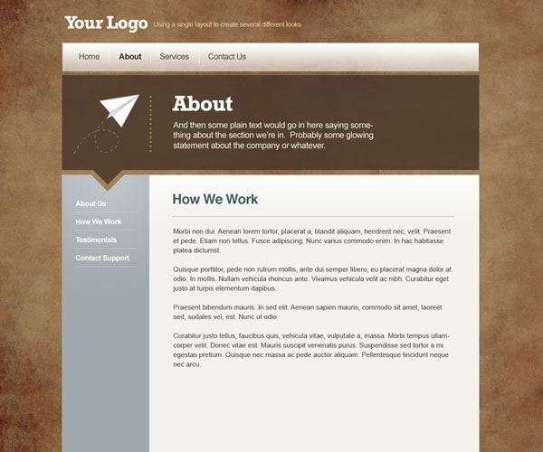 What is easily done with a tough texture background like grass is even easier to do with simpler textures like this paper texture from Bittbox. Because the source image is better you can create much larger tiles for the background which are much less likely to look repeated. 8 - Pixel Patterns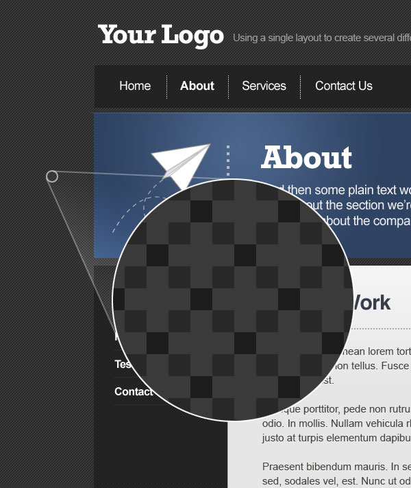 Another option for backgrounds are simple pixel patterns that when repeated give a background a bit of texture. The pattern shown in this variation of the layout is the one I used on Creattica Daily. You can create patterns like this really easily. To make this effect, just create a new image 4px wide by 5px high and zoom in as far as you can, then draw in these pixels: Then, press CTRL-A to select everything and go to Edit > Define Pattern, give it a name then you can apply the pattern with a Pattern Overlay through a layer’s blending options. So back on your main PSD file you right click the layer you want to add the pattern to, then select Blending Options then choose Pattern Overlay. In the image above I’ve set the pattern to Multiply onto a darkish grey background. It’s actually quite fun to play with these types of pixel patterns. The pixel loving folk at K10K have a library of Pixel Patterns you can also check out for far more advanced designs. 9 - Large Background Photos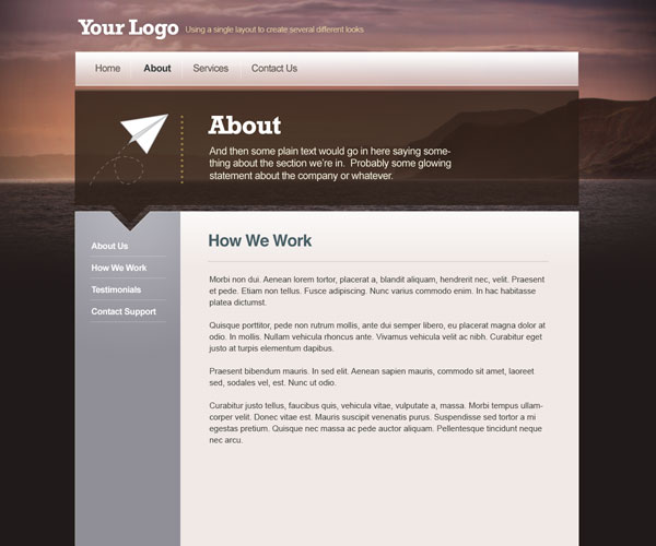 The last variation we’ll be looking at is using a single, untiled photo. Here I’m using a nice photo of West Bay Cliffs by Cristiano Betta that I found on Flickr: 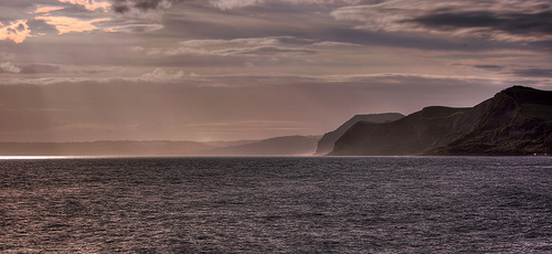 It’s a nice wide photo and it made for a nice colour scheme. So here are a few quick steps I took to place the image. 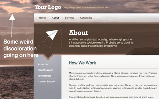 Here it is just sitting in the background of our design. With some transparency it’s already looking quite neat, but what is going on in the top left? 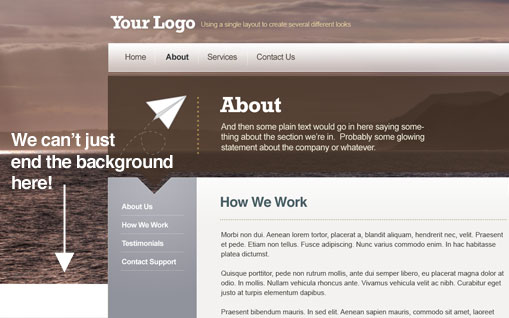 Moving the photo up about 50px pushes the weird discoloured parts off the page. The next problem is that we can’t have an endless photo background, so we’ll fade it into a colour. 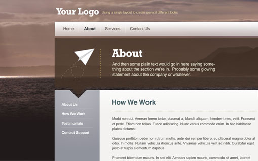 Picking a darker colour from the sea, we create a new layer and draw in a gradient fading from the colour to transparent. This sits above the ocean background nicely and blends it out. 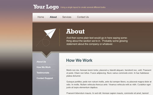 Now the background actually looks a bit flat so it would be nice to brighten up the colours a bit. To do this we’ll overlay the photo with a gradient of colours matched off the image. In the image above you can see I’ve drawn in a gradient using the purples and oranges of the original image.
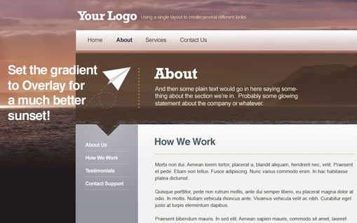 Setting the gradient layer to Overlay and 70% really brightens up the sunset and makes it look a lot more vibrant. 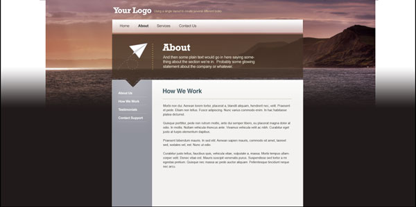 Now the next problem is that we need to have the photo blend off on the sides. This is going to be tricky because on one side we have a mountain and on the other it’s just sky. So probably the best solution is to blend off into the dark colours. For most people they won’t see this, it’s just for all those people using a giant screen and opening their browsers right up. 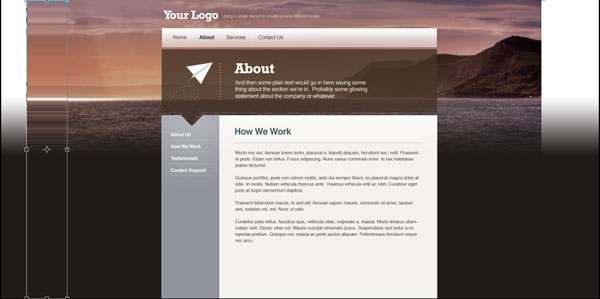 So the first thing we’ll do is grab a 1px vertical selection from each outermost edge of the picture and hit CTRL-T to transform it across. The reason we do this is so that if any of the background shows through the colour I’m about to add it won’t look weird. 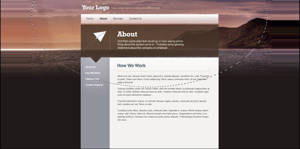 So next we add a new layer and draw in a giant ellipse in the background, press CTRL-SHIFT-I to invert the selection and fill it with the same dark colour we used earlier.  Now we deselect the layer and go to Filter > Blur > Gaussian Blur to blur our colour in, using a radius of 80px. Then duplicate this layer and blur it again using a radius of 120px, then a third time with a radius of 160px. This should give a nice soft graduation. So our final design with a photo background for most people will look like the image shown above. But we can rest assured that even a huge browser window won’t reveal anything silly. More on Large Background ImagesYou can learn more about designing with large background images by reading these three great articles:
Summary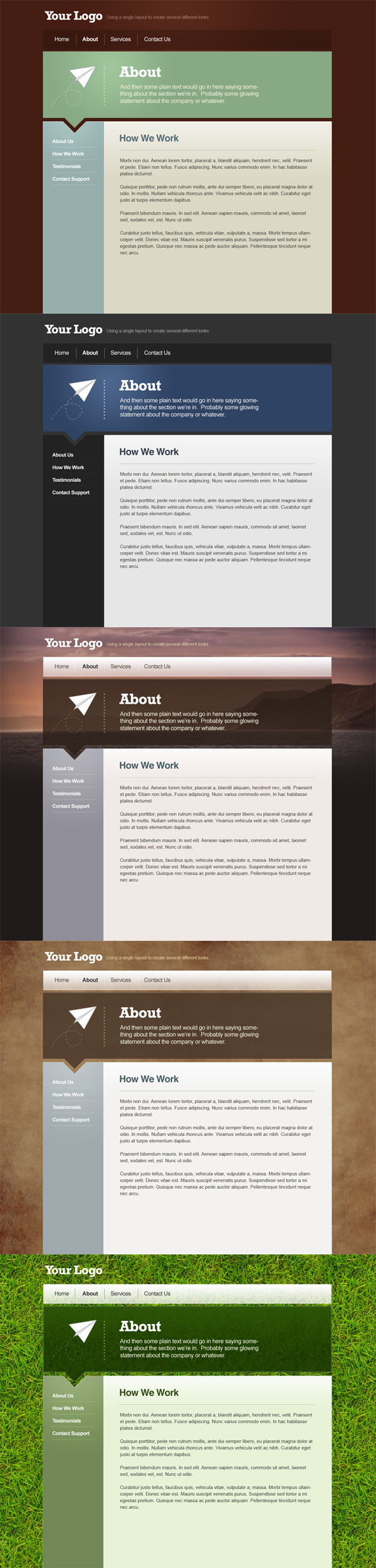 As you can see we’ve gotten a lot of mileage out of our one simple layout and hopefully along the way you’ve gotten something useful out of the process!
|
| How a Turn a Texture into a Seamlessly Tiled Background Posted: 01 Dec 2008 10:00 AM PST Tiled backgrounds are great for both website backgrounds and in all kinds of Photoshop work. They are particularly useful when working with textures where you need a larger overall background than the small image you have to work with. In this quick tutorial I’ll take you through taking a texture and turning it into a background image ready for seamless tiling. It’s a useful little technique that’s been around forever. We need this technique for today’s other tutorial - How a Simple Layout Can Be Mixed ‘n’ Matched with Patterns, Photos and Backgrounds.
Why you can’t just tile any old photo So in this tutorial we want to create a tiled background of a grass texture. There’s a fantastic photo of grass on Flickr by 100kr which we can use. However if we just tile the image as is, the result isn’t very good. As you can see above it’s very clear where the image is being repeated and the dark patches look pretty weird. So to turn that photo into a tiled background we need to first remove any irregularities, and then make the edges blend in to each other. Step 1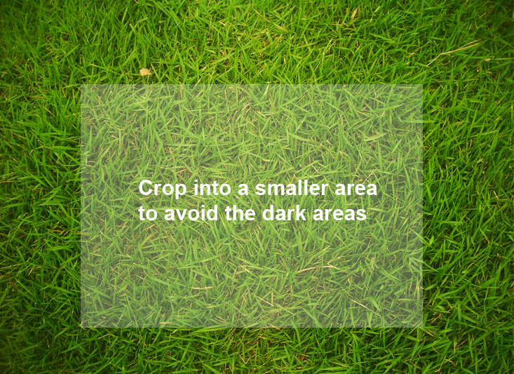 So the first step is to grab the main image and then crop into a section that doesn’t have the really dark corner patches. Something like the box shown above. Step 2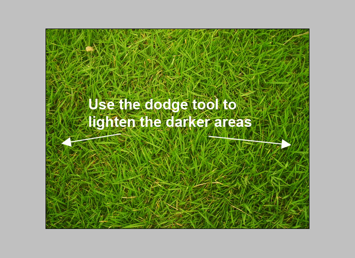 Here is our segment. I’ve actually shrunk it down a bit so that the texture isn’t so oversharpened. Now although it’s mostly evenly coloured, we could do with lightening the edges. The more even we can get the image the better as slight differences are quite glaring when the background is tiled. So just grab the Dodge Tool (O) and with a large soft brush, just gently brush over the left and right edges to lighten them up a shade. Don’t go overboard though as the grass will look washed out. Step 3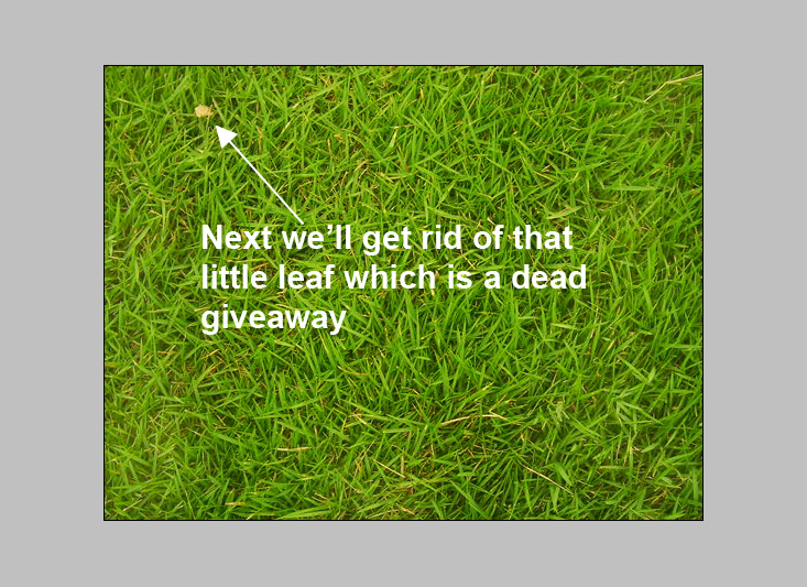 As you can see above the grass is looking a lot more uniformly coloured. But there is a little leaf in the top left, that is going to be a dead giveaway if the same leaf appears over and over again, so we should get rid of it. To do this grab the Patch Tool (J) and draw a shape around the leaf then drag with your mouse to get an area nearby to patch it with. (Note that the Patch tool should be set to Source and not Destination, otherwise you use it slightly differently) Step 4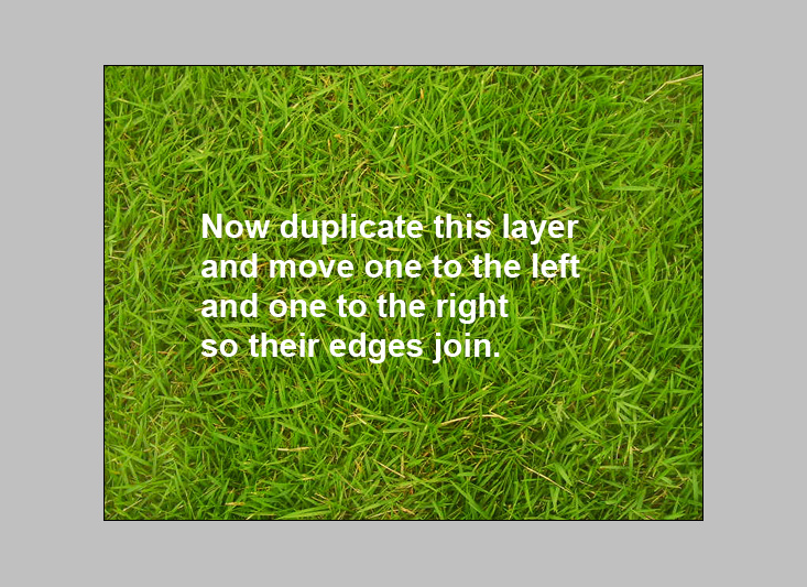 So our background is looking pretty nice and uniform now. We just need to make the edges bleed into each other. So duplicate the grass layer. Then move the first layer to the left and the second layer to the right. Keep doing this until you can see both layers with a white gap in between. Now bring them together so the right most edge of the first layer touches the left most edge of the second layer. Step 5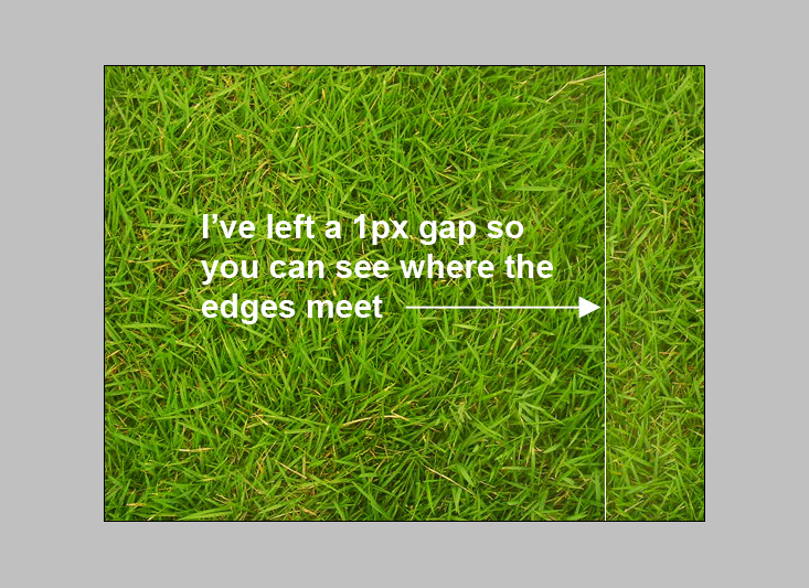 Here you can see the two layers almost touching. Bring them together so there isn’t any white in between and merge the two layers into one. Step 6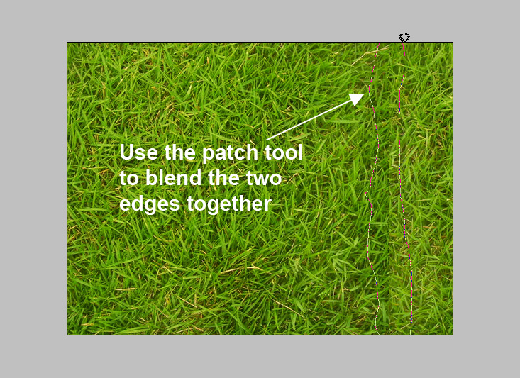 Now we again use the patch tool to draw a rough shape around the edge where the two layers meet, then use your mouse to drag a nearby area over to patch it up. Step 7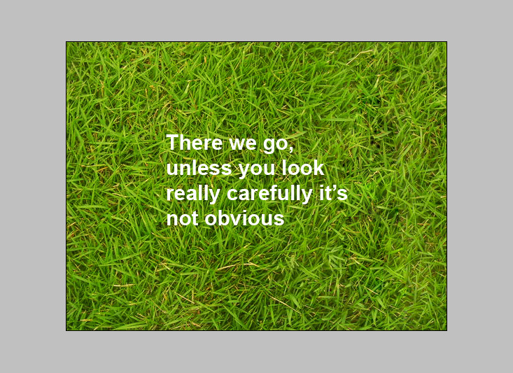 The patch tool makes this sort of operation really easy, especially with a background as noisy as this grass. As you can see unless you look really carefully it’s not apparent where the blend line is. If you wanted to you could go into fine detail and clone individual blades of grass - but this is fine for our purposes. Step 8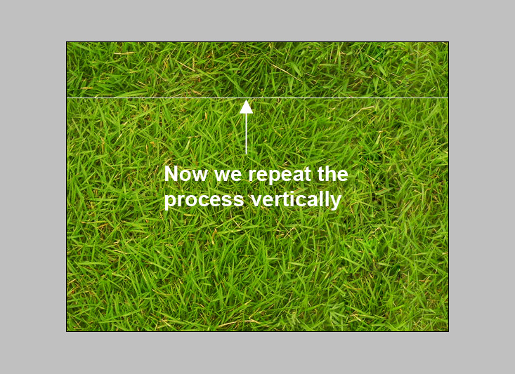 Now we repeat the same process vertically. So duplicate the layer and move one down and one up until the bottom and top edges meet. Merge the layer together and use the patch tool to get rid of the edge. Step 9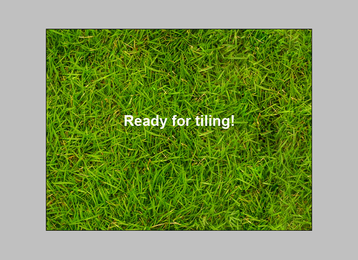 And now we are ready for tiling! The reason this will work is we’ve effectively gotten rid of those edges, the new edges of the document already match up because we moved the layers equally left and right so that the right edge of this document actually is the next pixel along from the left edge. Step 10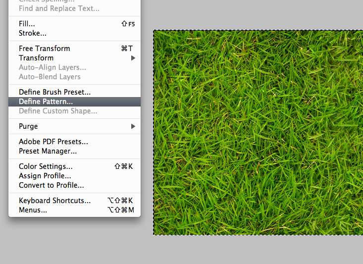 So press CTRL-A to select everything and go to Edit > Define Pattern. Step 11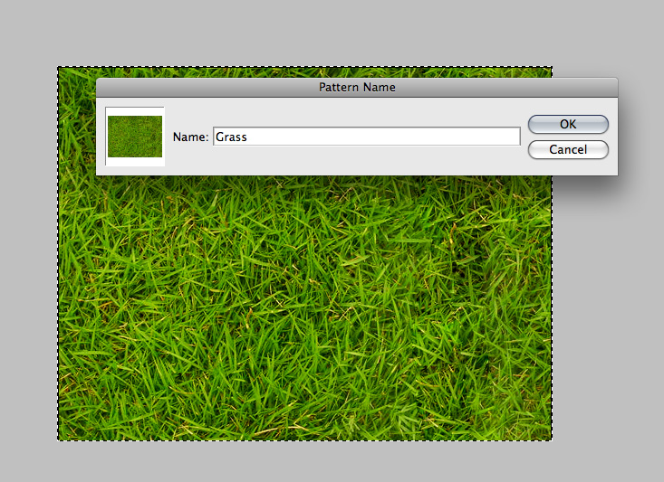 Now we give the pattern a name Step 12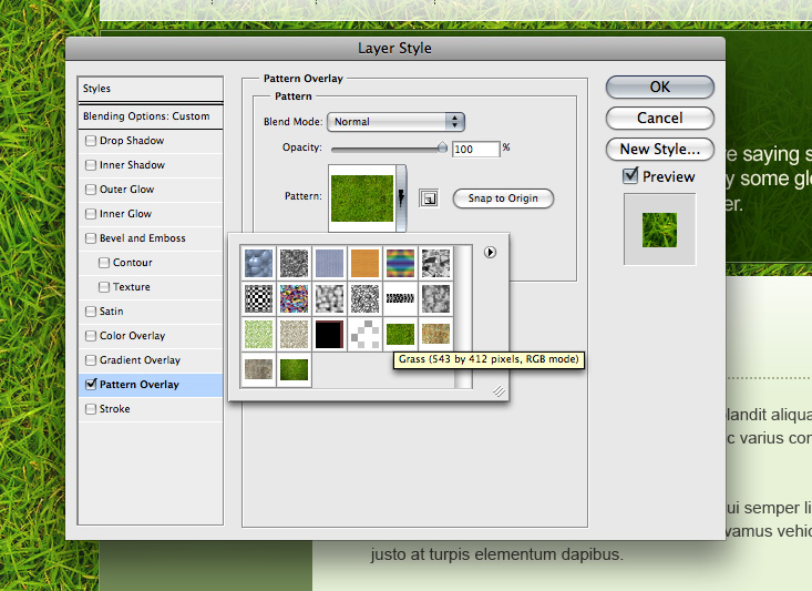 Now on any layer if you select blending options and tick the Pattern Overlay box you can choose from your set of custom patterns as shown, including the grass one we just made. In the image above you can see me applying the pattern into a website background. Of course you should also save the pattern image as a PSD or JPG itself as you may need it as a standalone image. For example if you were to use it as a background image in an HTML document you’d need the single JPG image, not a Photoshop "Pattern". Finito! Here’s our tiled grass. As you can see there is a bit of a dark patch that gives it away, but because I’m going to be using this as a background to a website it’s not a big deal as there will be stuff over the top. Nonetheless you could easily go back and patch up that spot to make it more seamless. Update - Filter > Other > OffsetThanks to the commenters who pointed out that there is in fact a simpler way to offset the background using a filter! Just go to Filter > Other > Offset and select a pixel amount to move the image by both horizontally and vertically. Thanks for the tip guys! I learn something new everyday 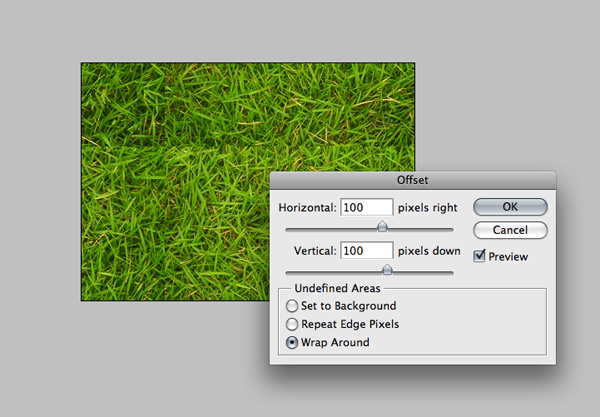
|
| Web Design Week on PSDTUTS + You Can Now Sell Photoshop Templates via ThemeForest Posted: 01 Dec 2008 06:30 AM PST For as long as I can remember we’ve gotten requests for more web design posts here on PSDTUTS. Well web design fans, it’s your lucky day because all this week we’ll be bringing you articles and tutorials on just that topic. What’s the occasion? Well today our sister site ThemeForest is adding a whole new section - Photoshop Templates - meaning you can now sell your straight Photoshop designs via ThemeForest.
The Week’s HUGE Schedule!Because I’m notorious for planning and promising tutorials that I then completely forget to finish, this time I decided to write them all ahead of time, so readers, here’s the schedule of posts to look out for, they are all (well mostly) ready and loaded into WordPress:
As you can see it’s going to be one heck of a big week here on PSDTUTS, culminating in a big cash giveaway so that 2,500 PSDTUTS readers will get a credit on their accounts to test out the site (which of course means it’s a good time to have files for sale). Who am I?Because advice is only as good as the person who gives it, I thought I should quickly mention who I am. My name is Collis! I have a love of exclamation marks and have been working as a web designer now for about 5 or 6 years. I design all the Envato sites like this one you’re looking at right now, and prior to that I used to design for clients as a freelancer and a designer for a Sydney interactive agency. I certainly don’t know everything about web design though, not even remotely close, so when reading the articles and tutorials this week, feel free to pipe in with a comment on your thoughts and how things could be done better! … And please excuse all the exclamation marks. I try to remember to edit them out - I really do, but it’s just how I talk. Everything, especially web design, always seems so exciting The first article will be up in, oh, about 2 minutes! So enjoy Web Design Week, hopefully we can make it an annual tradition, and if you’re interested in selling your work via ThemeForest, then read on to learn more! Earn Extra Dough, Sell Your Designs … Over and OverIf you haven’t seen ThemeForest already, then I’m probably not doing my job (I’m responsible for marketing!), so you should head over immediately to keep me out of trouble. The site lets you buy and sell website templates in three forms:
Anyone with a bit of talent can sell their work and earn anything from a side income (check out this article - How I make $2000 a year without doing very much) to a pretty large paycheck (check out 9 Tips for Maximizing a Steady Income Stream by Selling Stock ). You are actually selling a license to use the design or template, which means you can keep selling the same item over and over which is the beauty of creating a passive income stream that keeps trickling in months or years after you’ve stopped working on it. ThemeForest launched just recently and most authors only have a few items in their portfolio, but nevertheless there are already four authors earning over a thousand a month. And that number will only climb as more people are introduced to the site and author portfolios get larger. Each time you sell an item you receive a slice of the cash, ranging between 25% and 50% of the sale depending on whether you are selling elsewhere and how well you are doing. On top of that if you refer customers you’ll get another 50% through the referral program. So you might be thinking, hey I’m a web designer, why don’t I just make a website to sell my own items! What ThemeForest provides is a service to take all the hassle out of selling. If you sell your templates with us you won’t need to do anything other than upload them. We take care of payments, refunds, marketing, hosting, and pretty much everything aside from the actual templates themselves, we bring thousands of buyers from our related marketplaces FlashDen and AudioJungle as well as a solid, easy to use site and system. And if you find selling templates is making you a mint, you can always set up your own shop later anyway. Another common question is why the low %’s. Actually there are similar (competing) marketplaces around for both Flash and Themes, and they offer higher commission rates than FlashDen and ThemeForest (from memory 50% - 60%). So you’d think that would logically mean more income right? Nope, we work very hard to make sure that our sites benefit authors and I’m confident you’ll find that you can get *by far* the best result selling through the Envato Marketplaces. Still I always encourage everyone to do your research and figure out the best solution for you. And we’ll keep working hard to make sure that best solution just happens to be us Ready to sell your Photoshop Designs and Web Templates? Head over and read our short authoring tutorial to get started today! Otherwise stay tuned for all the Web Design Week action right here on PSDTUTS! |
 Part of Web Design Week
| You are subscribed to email updates from PSDTUTS To stop receiving these emails, you may unsubscribe now. | Email delivery powered by Google |
Inbox too full?  Subscribe to the feed version of PSDTUTS in a feed reader. Subscribe to the feed version of PSDTUTS in a feed reader. | |
| If you prefer to unsubscribe via postal mail, write to: PSDTUTS, c/o Google, 20 W Kinzie, Chicago IL USA 60610 | |
0 comments:
Post a Comment